Simpli Theory

Service
Concept and development
Technology
Android, iOS, backend
Client
Simpli AG
Year
2014 – 2015
What was Karlmax’s role in the project?
We worked together with the client on the concept and on various versions of the app and then implemented these for Android and iOS. The client later took over the code and released their own versions.
Why does the user need the app?
Because the app modernizes learning the theory side of the driving test
What can the app do?
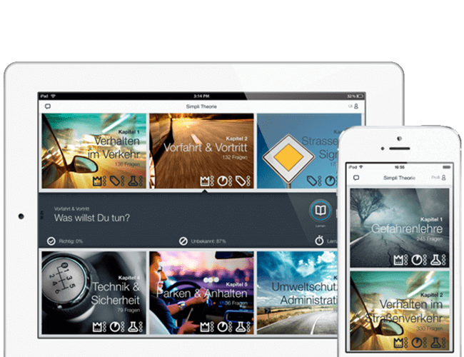
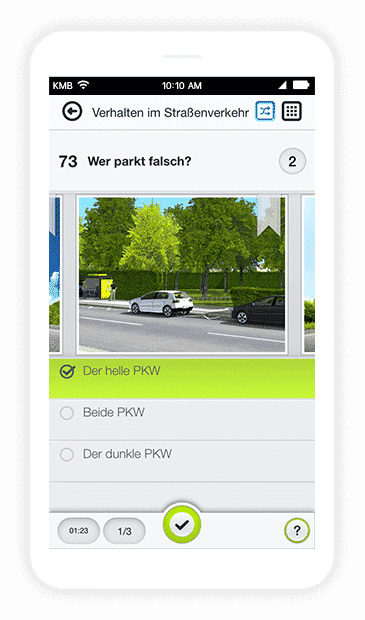
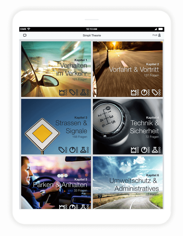
SimpLi is an app which allows a learner driver to learn for their theoretical driving test. In either iOS or Android, a learner driver can answer all the questions from the official test catalogue as often as they like, in Germany, Austria or Switzerland. The heart of the app is its ‘practice mode’, sorted into categories and equipped with pictures and videos according to country. At entry level, the learner driver runs through the questions, answers them, and is immediately informed which were answered correctly and which incorrectly. In ‘play mode’, it’s all about answering as many questions as possible in a limited amount of time, or alternatively with the least number of wrong answers. And at the end, the hopeful road user can use ‘test mode’ to try out the test properly. This is where questions are ordered according to realistic criteria, and adapted to the test requirements of the relevant country. If the user manages to answer most of the questions correctly in a fixed timeframe, they shouldn’t have any problem with the real thing.

The challenge
The especially complex challenge in this project was to simulate the driving test for different countries. Since in Germany, Austria and Switzerland the test facilities, the answer possibilities and even the media used are all extremely different, we had to develop complex mechanisms that would work for every country and stay relevant into the near future. The evaluation of answered questions presented another challenge: “How should you react when there’s a child on the side of the road? A: Hoot B: Be ready to brake C: Reduce speed”. If a multiple choice question has more than one correct answer but the student has only chosen one, how do you show them in a single visual presentation, which answer was correct, which would also have been correct, and how would their answer have been evaluated in a real test?
How did we proceed?
In order to create a good UI, we tried out numerous designs: on the whiteboard, on paper, sometimes directly in the app prototype. When we found the general appearance we were happy with, we optimised the individual elements—for example the element to log in had only one answer possibility. We were able to watch various learners’ trial runs and thereby find out which approaches were good and which didn’t work as well. After a few iterations, we found a workable solution: The chosen answers were shown using icons and the background colour changed to show if the answer was correct. For all countries there was also a calculation in canonical numbers, for example the eight mistakes permitted in the German driving test. At the end of each test there was an overview with all questions and answers and the test results.

Behind the scenes or: How an app turned into a competition in the office
Well to be honest I can’t really remember my theory test, except maybe for some of the questions. When testing the app I found myself confronted with these same kinds of riddles. How nice then to have so many well-educated, car-crazy colleagues who judge you incapable of driving a car on a public road unless you know all these answers off the top of your head. And how nice it is then to see their faces when the answer field turns red and their answer wasn’t right after all. So, we all learned a lot, we all laughed a lot, and perhaps the streets are now just a little bit safer.


