mika
Services
Development, Design
Technology
Android, iOS, Backend
Client
Fosanis GmbH
Year
2018 – 2019
What was Karlmax’s role in the project?
Karlmax Berlin developed an app for Android and iOS based on Fosanis GmbH’s existing web-based solution, and modified the existing backend.
Why does the user need the app?
Because a cancer diagnosis is overwhelming and no patient should be left to deal with it alone.
What can the app do?
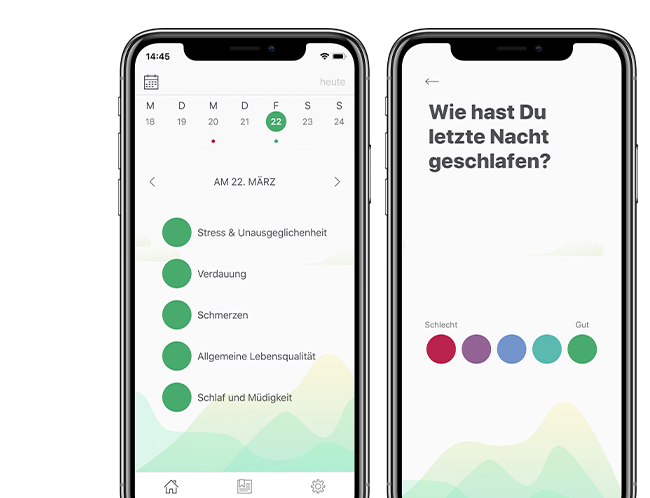
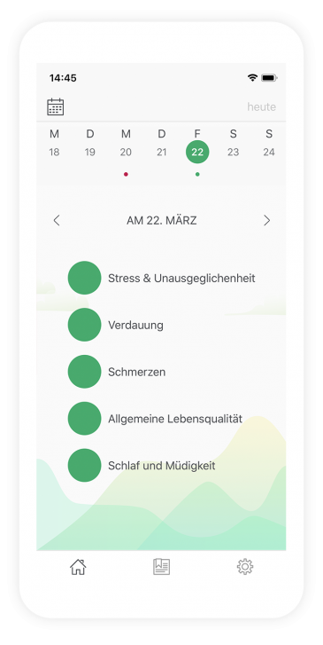
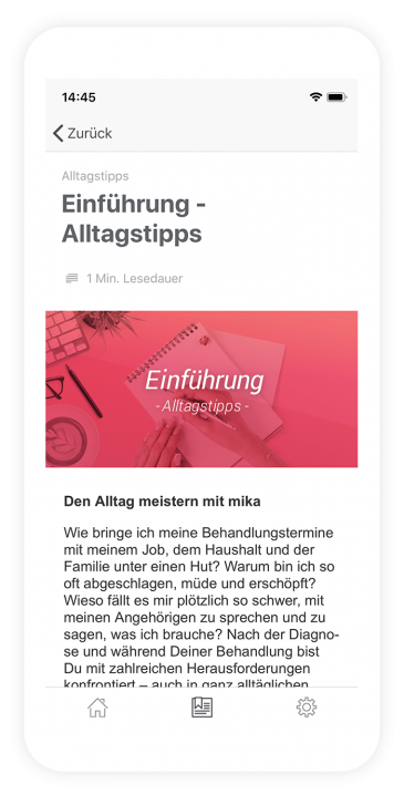
Mika is an app that aims to support and accompany cancer patients and those affected during therapy. The app provides valuable information and technical articles about the therapy, tailored to the user. A daily check-up helps to document symptoms in their chronological order.
The challenge
Developing an app about cancer presents many challenges. First, the app should provide patients and their families with valuable, medically-verified information to help them during cancer treatment. On the other hand, since the work meant keeping a certain distance from the app’s subject, our team was faced with the challenge of blocking out any experiences they may have had with cancer. Often, the best strategy was to empathize with our users and focus on developing an app that helps them in this situation.
One technical challenge involved adapting the existing backend of the website for the new app’s check-up dialog. The other challenge was to develop the existing designs further, keeping the subject matter in mind, and to make them app-specific. Particularly noteworthy was the calendar, whose background was a landscape that should symbolize the strain (or relief) caused by the illness.
How did we proceed?
Our client Fosanis already had an existing website that they wanted as an app. In addition to a new user interface, features have been improved and simplified to give the app added value over the website. For the app, Fosanis already had concrete ideas and designs, which we adapted to the context of an app, and which we were allowed to treat as a basis for further designs.
The subject of data security was taken very seriously, with all information being encrypted. In order to encourage daily use, it was important for cancer patients and their relatives to enjoy using the app despite the serious subject matter. An appealing design with flowing animations allowed us to realize this. We combined onboarding, a daily check-up, a calendar, a magazine and various settings in an app, and little by little the Mika App was born.
Behind the scenes – or: How we built an app that makes sense
There are numerous apps in the two app stores. We love to develop apps and already have a variety of different apps in our portfolio. This app was something special for all of us because it addresses people living in difficult situations: people with cancer or their relatives. Our client explained the personal background to the startup, and presented studies that prove the usefulness of a daily companion during cancer therapy.
