HaemActive
This case study tells the story of how we developed HaemActive at Karlmax Berlin, focusing on the concept and creation process and our findings after finalizing its MVP.
It shall provide a detailed impression of the necessary steps and tasks that need to be completed before the software development process starts. We also want to shed some light on the idea behind different intermediate artifacts and how we use them in the early project stages to generate insights.
A more general overview of the project can be found in our project story.
Basic assumptions
People with Haemophilia require a certain level of fitness to prevent injuries. However, many people with Haemophilia and relatives are unsure which exercises are suitable, and shy away from the physical challenge.
Users & Audience
People with Haemophilia of different ages and clinical pictures; parents and relatives, as well as professionals like physiotherapists and doctors.
Challenge
To emphasize NovoNordisk‘s commitment to people with haemophilia and promote comprehensive care. To give them security in their physiotherapy exercises and motivate them towards regular exercise. To grant physical therapists a tool to care for their clients and provide relief. To support doctors in providing optimal all-round care.
Solution
Living Safely With Haemophilia: Relieve Anxiety, Motivate and Mobilize. Clients can perform suitable exercises safely and regularly using videos and instructions, allowing them to stay healthy and develop individual fitness routines.

User flow
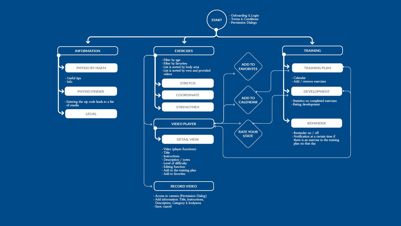
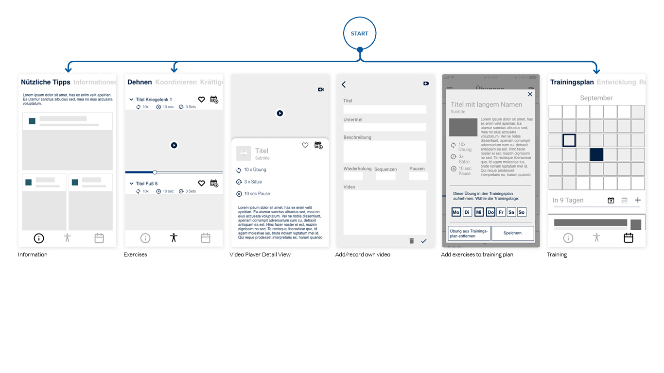
Working closely with the customer we developed a straightforward architecture. This enabled the development team to have a comprehensive view of the product’s different areas. At the same time, it made the navigation and certain interactions visible in order to be validated before moving to the next step.
User stories
From the user flow, we created a concept to solve the problem for the initial phase.
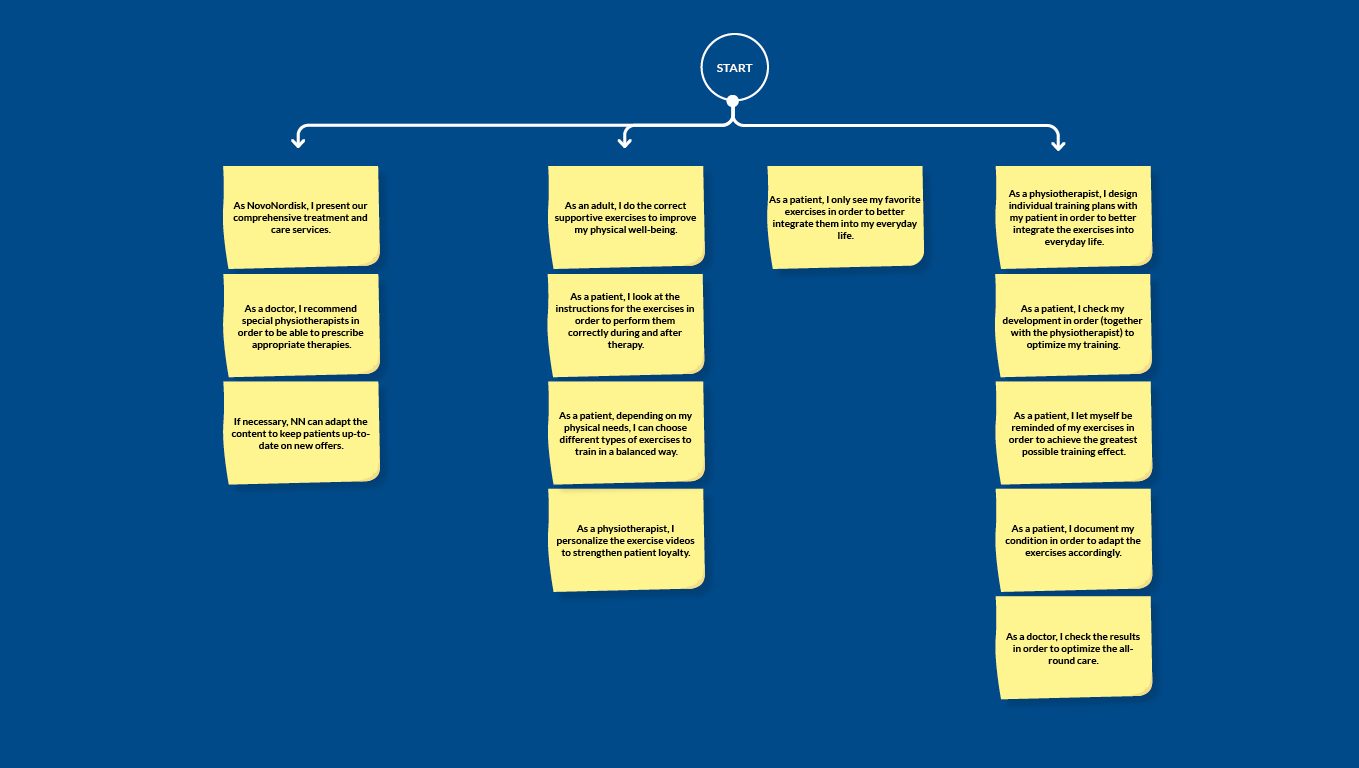
To assess its sustainability and viability, we tested the concept with doctors, physiotherapists, and regular users. We learned about the expectations for an App and adjusted the feature set once more. As a result of this, we were able to start preparing the backlog with epics and user stories – the base for the wireframes’ design.
Wireframes
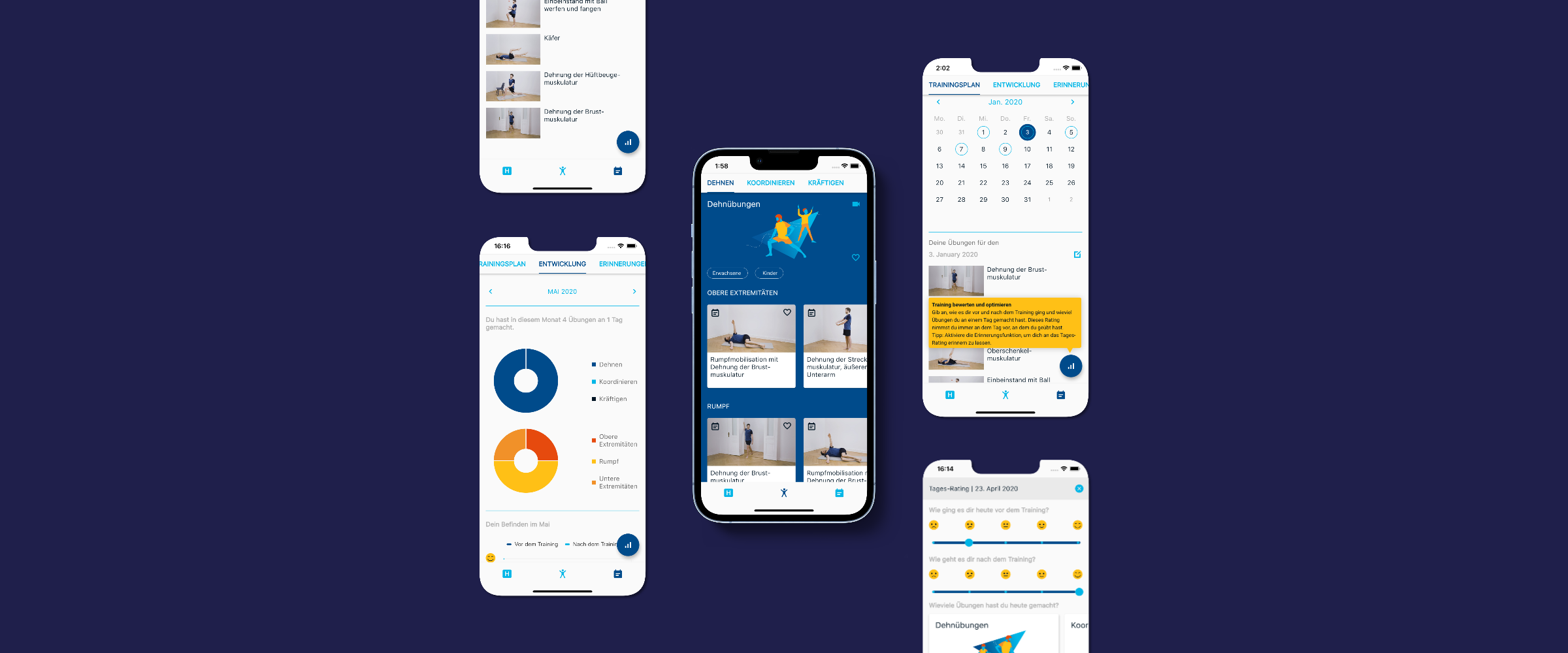
We decided to build a bottom navigation bar with three main pages: Information, Exercises, and Training.
Each area is organized in subsections with an identical format: top tab bar. In this way, the user is presented with consistent navigation across each area and can focus on the content.
The main feature of the product is the video material provided by NovoNordisk. This carries out the main task of educating the user about exercises suitable for people with haemophilia. This makes the video player the central and most valuable part of this application.

Features
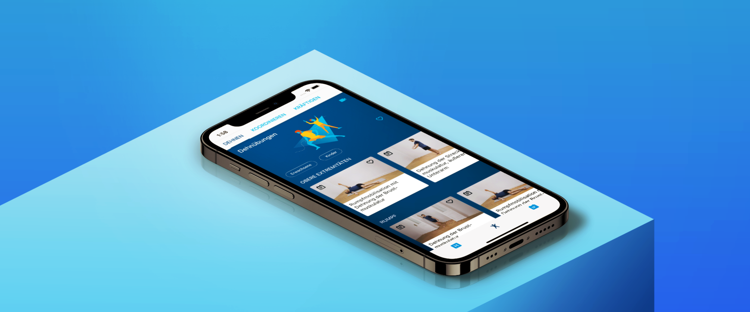
The exercise categories stretching, strengthening, and coordinating are each divided into three sub-categories: upper extremities, trunk, and lower extremities.
To open the video player, the user simply has to tap on a card, which then causes the details page to open. There, features like “Add to favorites” and “Add to training plan” are available.
The ability to record your own videos is one of the unique selling points of HaemActive and is offered in every category. The function can be started via the camera icon and is intuitive to use.
In order to act as an extension of the physiotherapist, the app aims to support training with exercises on a daily basis. It is intended that the individual videos can be combined to form a training plan.
Building an image
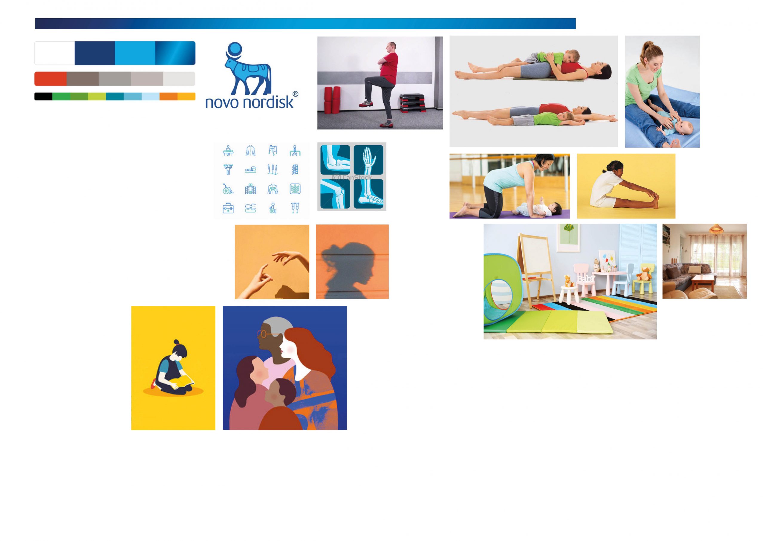
We started with a review of existing apps, taking into account standard guidelines and CI specifications from NovoNordisk. We discovered that a subtle UI, with playful graphics, makes the app pleasant and entertaining.
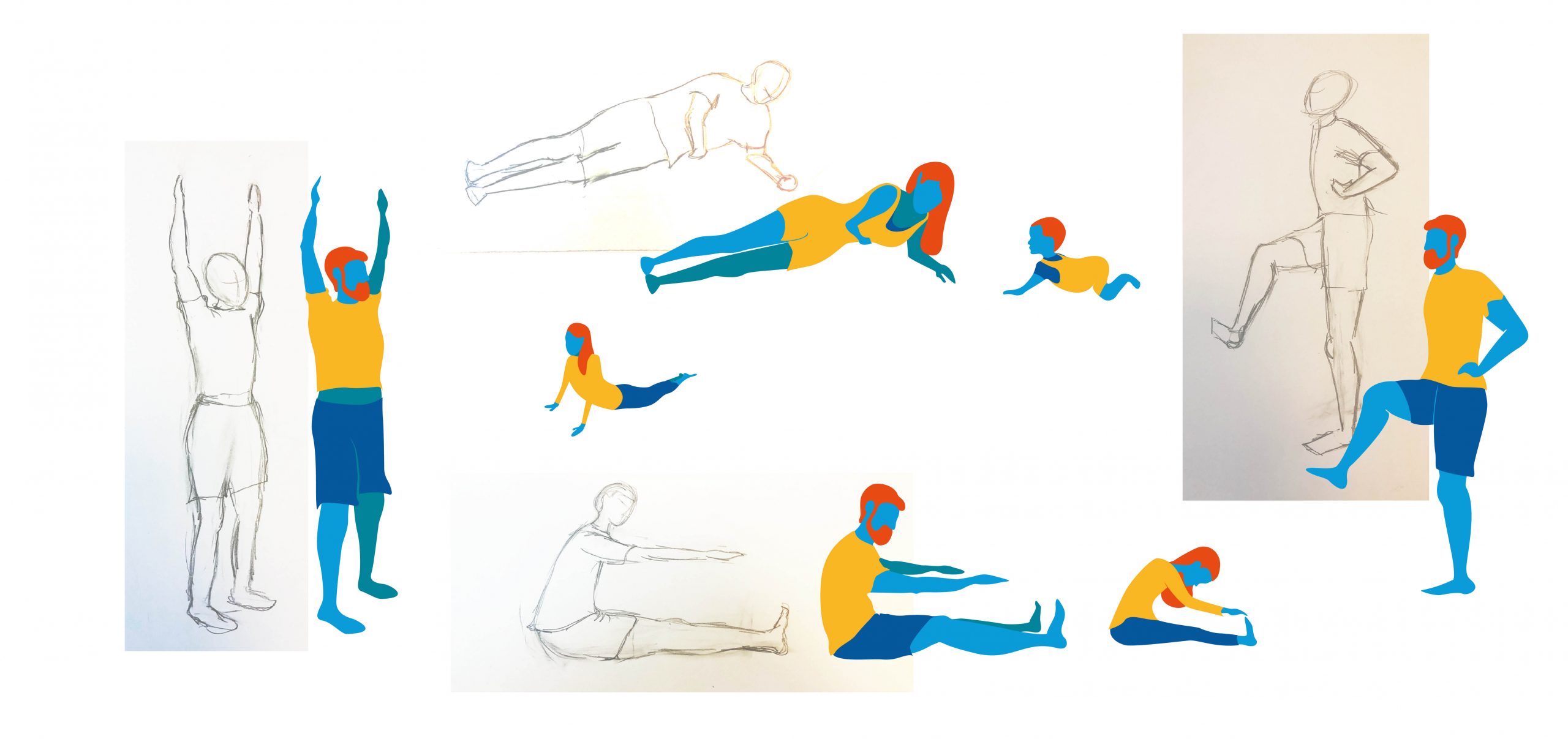
The mood board, which defines the visual language and the style of the app, is built on these findings. In order to get a better understanding of what to illustrate, we also studied the positions of the body during exercise.
Through the resulting illustrations, several product areas were graphically supported and symbolized. We have used them for the presentation of the categories as well as the background of interactions.
The style is kept deliberately simple. Details in faces and clothing are kept to a minimum in order to focus on the body.
Through the choice of colors, we avoid ethnic subtleties and can therefore avoid stereotypes for the user group.
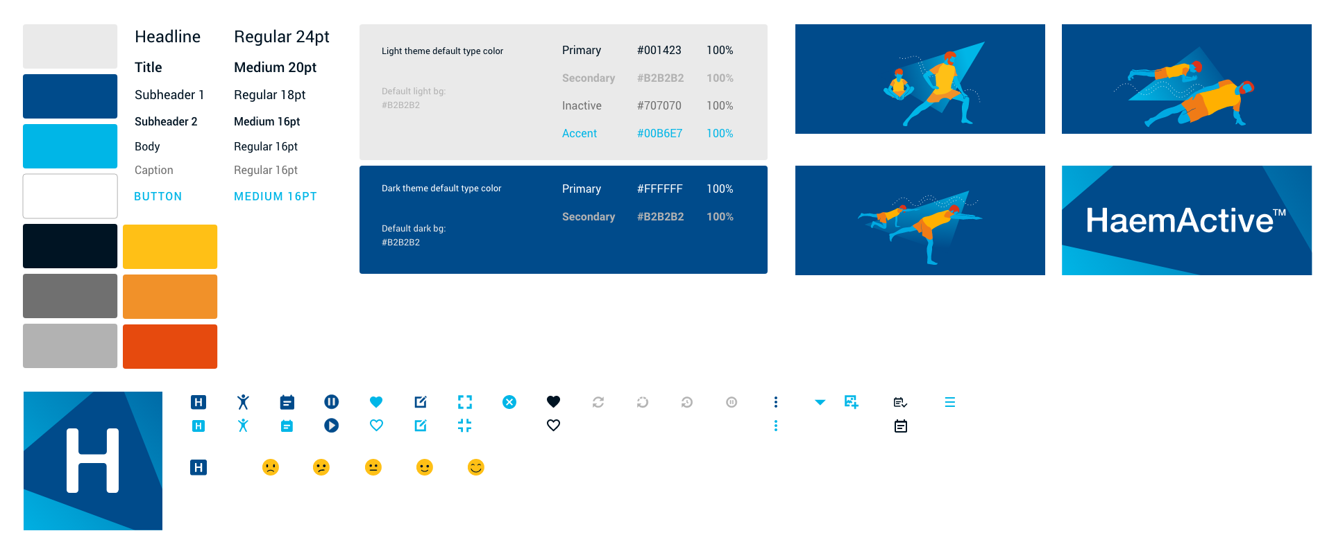
Creating the UI for a cross-platform application included generating illustrations and a design system as well as adapting the Google Material Guidelines for the interface. Our team decided to implement the app using the newly released cross-platform framework Flutter.
We chose clear and vivid colors that are part of the NovoNordisk color palette.
The main colors are white and dark blue. They are complemented by light blue, black and additional shades of gray.
For example, active states are colored in dark blue and inactive states in light blue. Informational elements such as the instructions for the exercises are colored in gray. The accompanying illustrations use a complementary color palette, consisting of additional NovoNordisk colors.
Bringing it all together
Our challenge was to provide people with haemophilia with security in their physiotherapy exercises and to motivate them towards regular exercise. By creating an intuitive navigation, cohesive visual system and user-friendly interactions, our team delivered a product now used by thousands of users around the globe.
