Coachyourself
This case study tells the story of how we developed CoachYourself at Karlmax Berlin, including the creation process and our findings after finalizing its MVP.
It provides a detailed picture of the necessary steps and tasks besides the software development work to create successful App projects. In addition to that we explain the rationale behind different intermediate artifacts.
By providing knowledge on how to deal with them correctly, CoachYourself creates space and openness for feelings in everyday life.
Users & Audience
Individuals operating within a high paced work-life environment, seeking balance and mindfulness as part of their daily routine.
Challenge
To create an appealing solution to help both meditation newbies and experienced meditators to quickly and easily feel better in everyday (work) life. Through targeted exercises, we aimed to give users the chance to reduce everyday stress, strengthen problem-solving skills and find paths to happiness, health and success.
Solution
Generate a meditation space that users can access at any time and feel personally addressed by the right question – „Which emotion do I need now in order to feel better?“
User journey
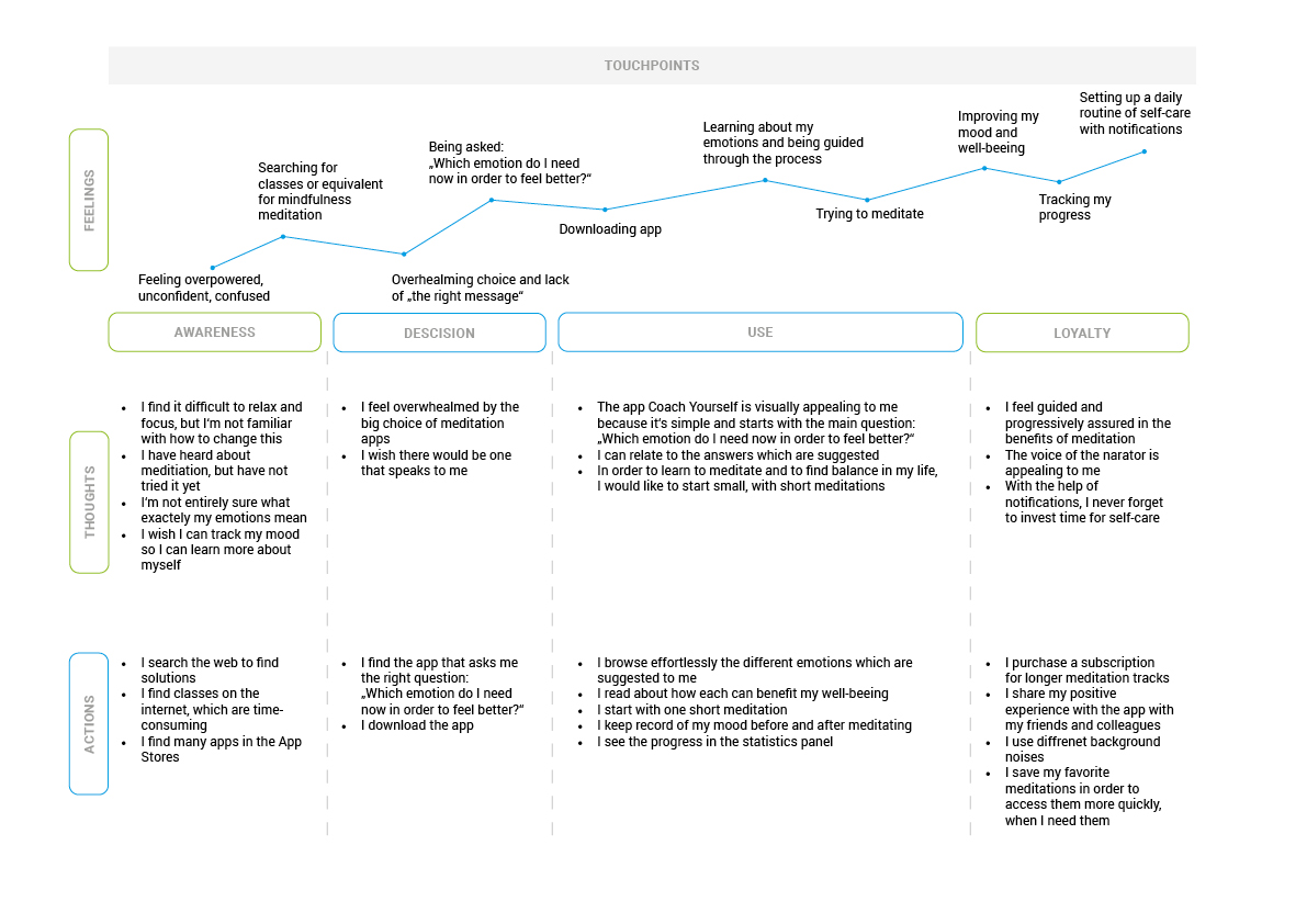
Working closely with our stakeholders, we built a journey map to identify potential pain points and frustrations for our users. Mapping these allowed us to build empathy and focus on solutions to achieve a harmonious and enjoyable user experience.
User flow
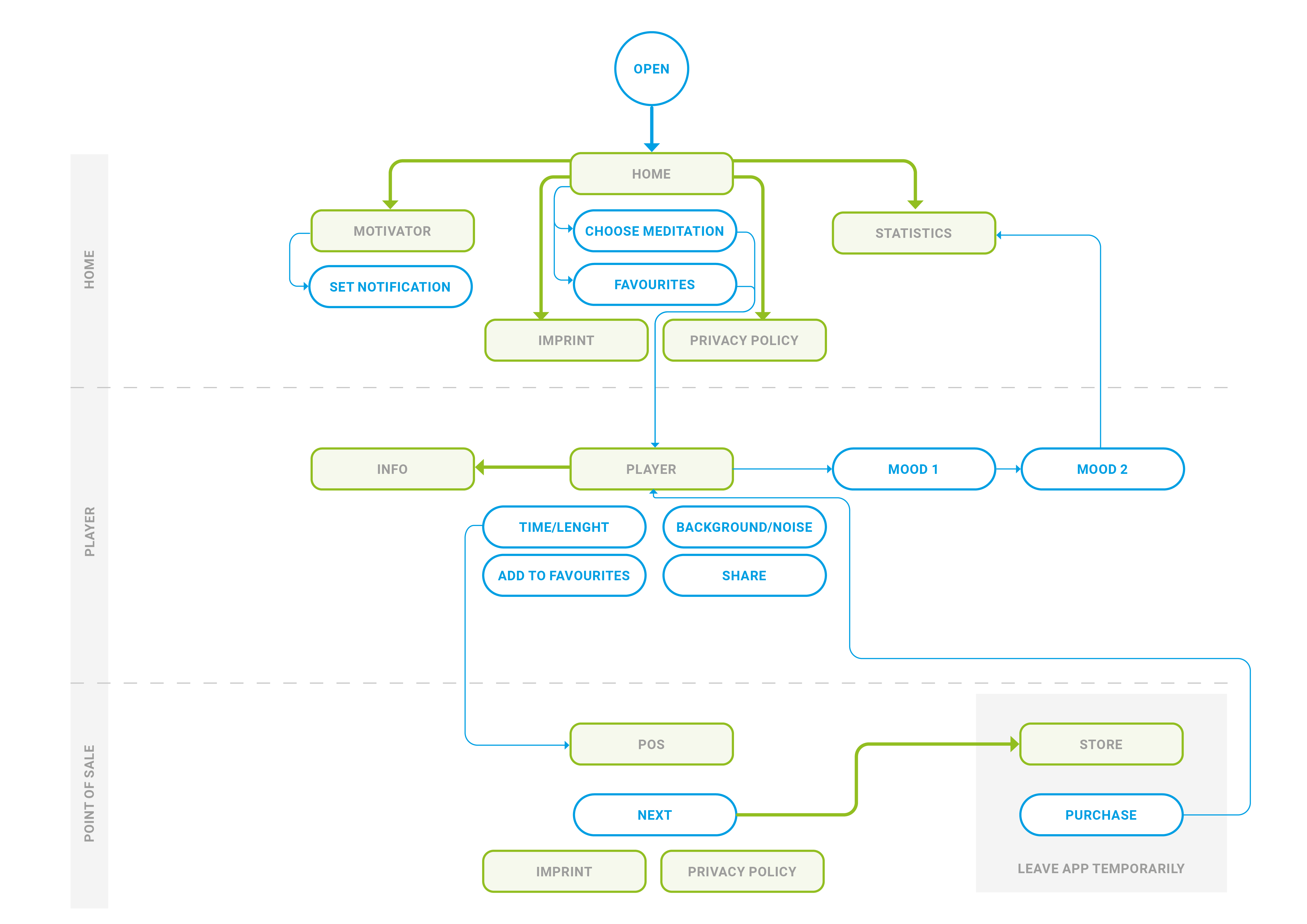
We identified the main features to be included in the app in order to define the MVP and mapped the user flows on those specifications. Based on the user flow, we adapted the information architecture in a way that would allow immediate access to the most relevant content – the player.
Sketching
Basing them on the flow we created for the MVP, putting the features together into the screens was fun. By Iterating with stakeholders at every step of the process, we were able to adapt a simple concept of navigation and intuitive interactive elements. We did this with one goal: to make sure the focus stayed on the central question – Which emotion do I need now in order to feel better? – with the answer bringing the user to the player.
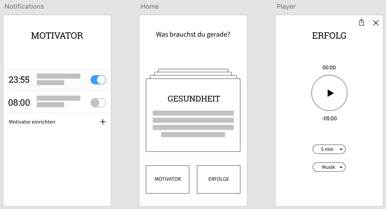
Low fidelity UI
Considering the function of the app, it was crucial to design an interface that helped to soothe the user in their environment. Here is where we took a dark path, literally. After trying out a few bright versions, we eventually decided that a dark UI would encourage users to be less distracted and to enjoy its calming mood and grounding ambience.
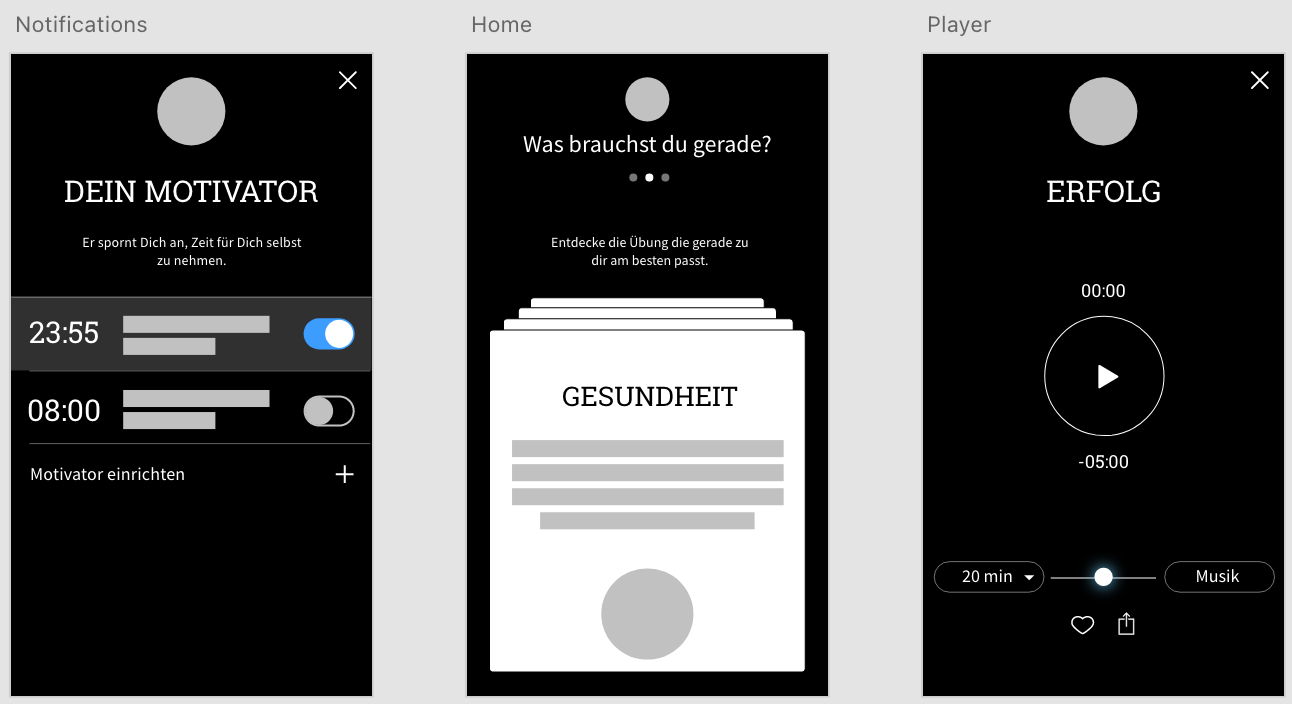
High fidelity mockups
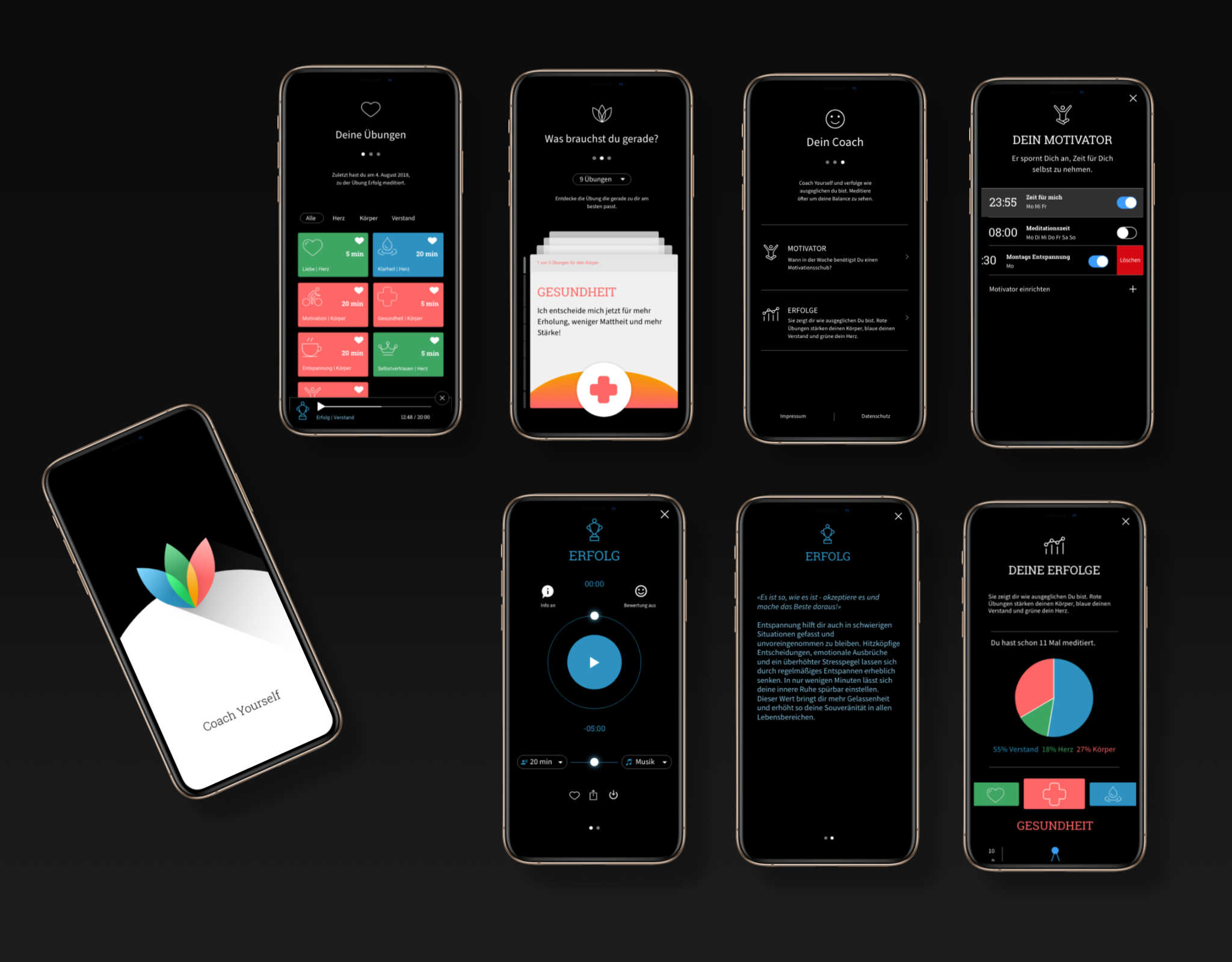
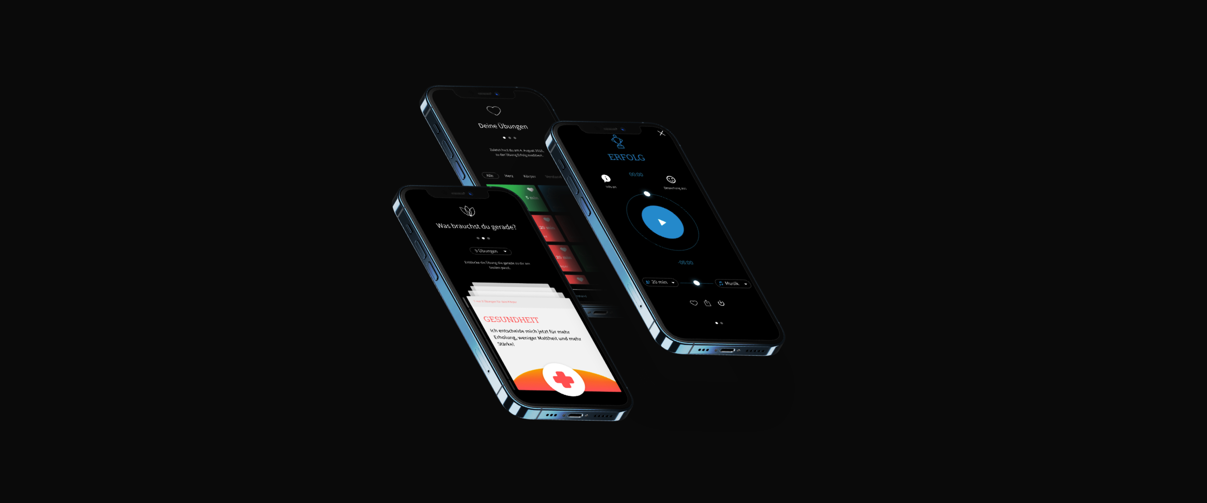
Eventually, the screens came together cohesively. In combination with a consistent color scheme and visual language, the end result was more than well received.
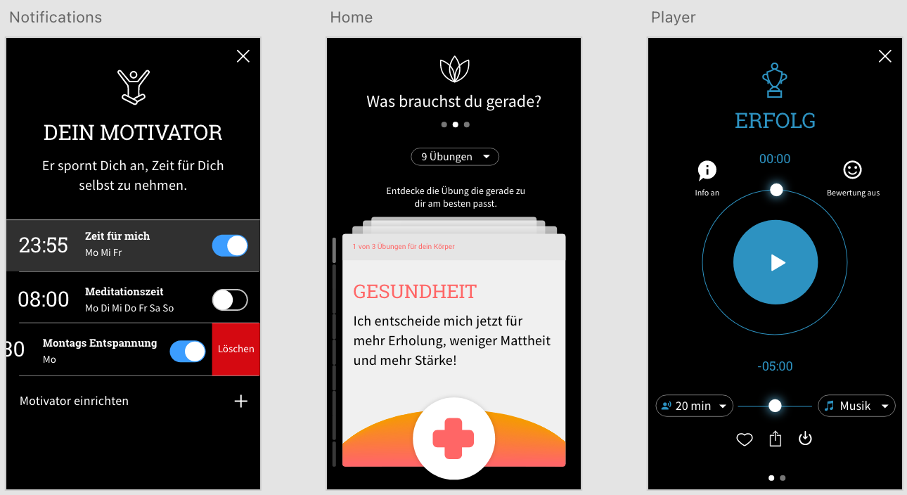
Brand
CoachYourself consists of meditations addressing three of the seven main chakras: mind, heart and energy. For each, we assigned a corresponding color, which together formed the basis of the product’s branding. Finally, the three chakras or elements came together in the form of an abstract lotus flower that was used as the brand logo. We then took the three elements to the next level, appointing a character figure with actual feelings to each.


Outcome
The creation of CoachYourself was a fun ride for our entire team. Working in parallel with our design department, our developers built the app using a relatively new cross-platform coming from Google called Flutter. Our MVP was featured at the Google IO 2018 and has received great feedback ever since.
